I wanted to share with you a few adorable interiors that I have seen around the web the last few days. These places really got me wanting to start redecorating...already...ha! In all seriousness, though, they got me feeling really creative and the first image I will show you gave me some ideas about the color palette I should use in my beige guest room!
 |
| Image by Petra Bindel, via Pinterest. |
I love everything about this modern but warm attic workspace. (The image is by photographer Petra Bindel.) The colorful artwork brightens up the white walls, while still giving off a very fresh and clean vibe. The busy, plush rug is perfectly juxtaposed by the modern yellow chair. And I would kill for that black desk. The vibe is eclectic but pulled together.
I have been very dissatisfied with the colors I have in my guest room. But, I tried to imagine this with my beige wall and I think it would work quite well. I am thinking that black with bright yellows, red/oranges and greens would look good. It may be time to paint my desk black. What do you think? I just can't stop starring at this picture!
 |
| Via the veda house. |
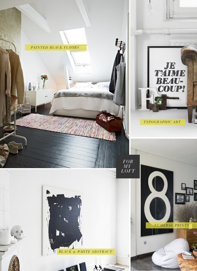
The next image is from the veda house. It's the lovely bedroom that I am particularly enamored with. It's really comfortable and looks like a great place to spend a lazy Sunday afternoon. And, though I'd never have the guts to have black floors, I think they look pretty cool here. I was also pleased to see that my 2 Euro discount market rugs resemble something more designer-ish. What do you think about this? Have you ever thought of painting your floors black? Would you ever actually do it?
 |
| Photograph by Katie Stratton for the veda house. I love the levels of height and texture here. |
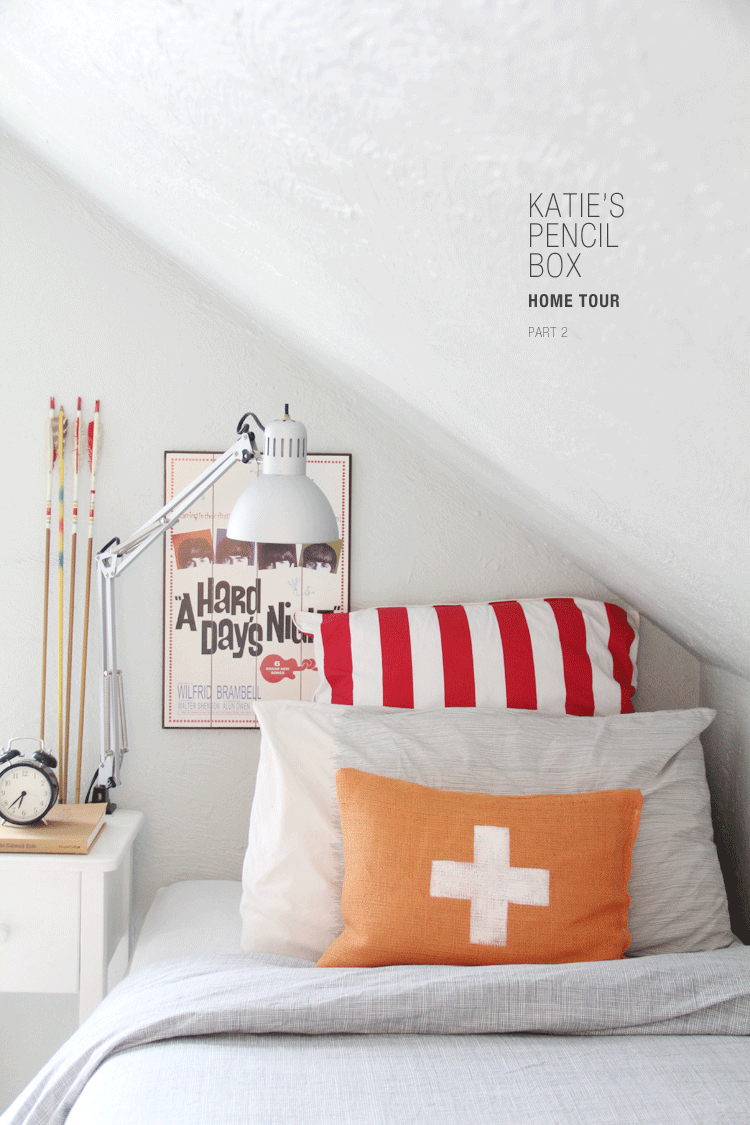
Finally, I just have to share a few pictures of the veda house's home tour with Katie Stratton (of Katie's Pencil Box, which you all know I L.O.V.E). I read Katie's blog everyday and am always inspired by it. Today she posted some really great advice about making a house a home. Her house is beautiful and perfectly put together. I found myself looking at these images, saying, "Hum, what a great idea. I hadn't thought of that."
 |
| Photograph by Katie Stratton for the veda house. |
 | ||
| Photograph by Katie Stratton for the veda house. |
In my opinion, Katie's keen eye and tendency toward the unexpected are what take decorating from being nice enough to being professional looking (without being the wrong kind of professional looking) and breathtaking. Going by the rules or being too methodical about decorating can make your home look like a model in a growing suburban subdivision. Taking risks and allowing your personality to shine through is what really makes your home interesting.
My advice is to focus on details and to look both at the whole and at the small corners. By looking at or thinking about the whole, you will prevent yourself from getting rid of something that might compliment your space just because it looks junky in the store (or on the street). I have to remind Peter to do this all the time. When I first brought home this chair, he thought I was crazy for thinking it was the holy grail of abandoned furniture. (It's crushed velvet! It's green! It's floral! It's huge!) But, I could picture how it would look in our space as a whole. Now that I have added it to our living room, he has to admit it works with everything else. It isn't nearly as crushed velvety, green or floral as it looked on the street. And, it is super comfortable. He has no complaints.
That being said, it is not enough to only think about the big picture, because a nice big picture cannot be stunning without a lot of details. You may have a beautiful bookcase or a big black wall, but it's how you accessorize them that decides if your look works or not. How is your bookcase filled? (Books should always be placed into a book case in various directions--vertically, horizontally, slanted--and should never be the only thing in your bookcase.) Do you have feminine or soft items around the room to tone down the black wall? Do you have art? Do you have trinkets?
Personally, I think all little corners of your home should be filled with many things that you love and/or use on a daily basis. Paint brushes look beautiful in a glass jar. Jewelry and nail polish look nice placed on trays on a dresser. Boxes, books and cups of pens look great on a desk. Making sure that your home is filled with pretty little spaces (think: things you can easily take a close up picture of, like this) is as essential as the bigger picture when pulling your home together.
Well, I hope you have liked some of these home and some of my thoughts on decorating for this Wednesday. As you know, I am not a professional; I am just really passionate (and maybe a little snotty) about decorating. What are your secrets to a cozy, well-decorated home? Do you have any? What do you think about the spaces above? What are your biggest challenges when it comes to decorating? Your biggest triumphs? I am looking forward to having you share!

No comments:
Post a Comment